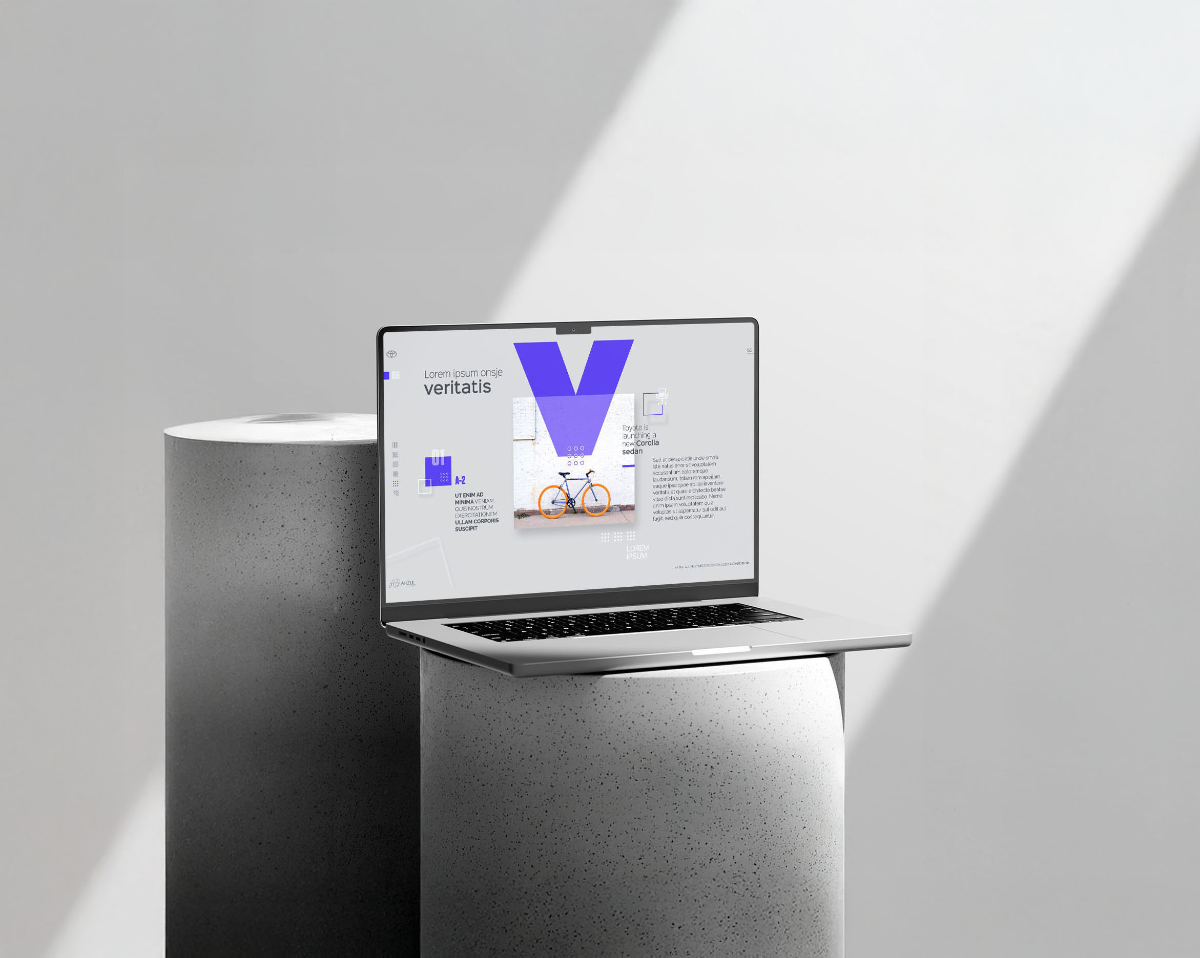
At Ahzul, I was part of a team responsible for designing detailed presentations that showcased important data for well-known brands. Each research project, product model, or study required a custom presentation design and template, ensuring that the information was both visually compelling and easy to navigate. My role involved balancing clarity and creativity, transforming complex data into engaging visual narratives that effectively communicated key insights.
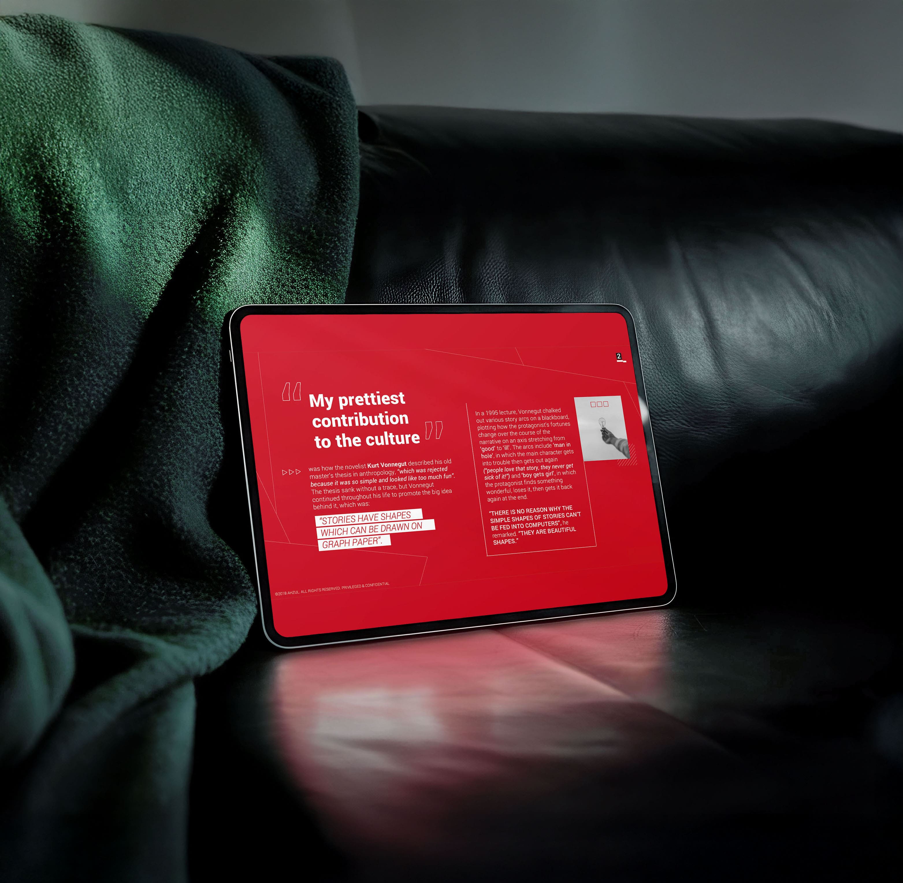
Beyond presentation design, I also contributed to the design of research documents and opinion-related entries, refining complex written content into polished, professional publications. My ability to merge data visualization with strong graphic design principles ensured that reports were not only informative but also captivating and impactful for stakeholders and decision-makers..
Working at Ahzul required handling high workloads with fast turnaround times, ensuring that presentations met tight deadlines without compromising quality. Each project demanded fresh, innovative layouts, making complex business reports and research documents not only accessible but also visually stimulating. This process involved careful attention to typography, layout structure, and visual hierarchy to enhance readability and engagement.
A crucial aspect of my work was the creation of infographics and photo-related slides, helping illustrate the research findings in a visually appealing way. These elements made it easier for audiences to grasp large quantities of data, ensuring the information remained digestible and engaging. The challenge was to make research reports not just informative but also visually compelling, maintaining a professional yet out-of-the-box approach to design.